Chop Idea Sharing Thread
 04-08-2010, 09:42 AM
#1
Thought this might be fun. Have you made a sig or chop that you think turned out especially well?
post it here to inspire your fellow choppers, offer tips to them, and perhaps ask for some pointers or suggestions
post it here to inspire your fellow choppers, offer tips to them, and perhaps ask for some pointers or suggestions
 04-08-2010, 10:05 AM
#2
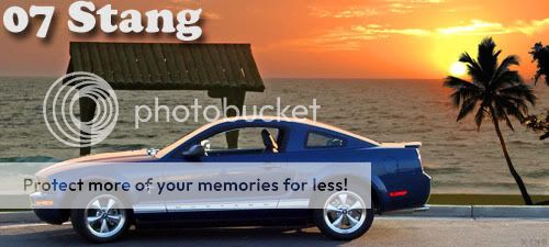
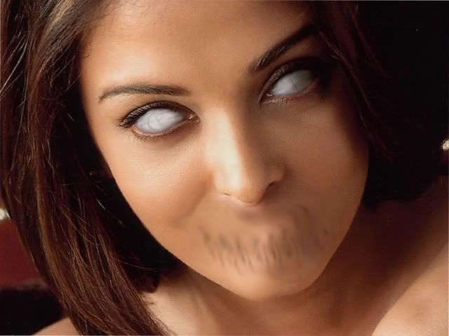
here's a few favorites i've done

make sure your shadows hit objects right to make sure it does not look like its just floating there

the "posterize" filter is your friend, as are watercolor, stroke, and the smudge tool

download brush sets, and use layer styles and overlays

download lots of fonts, and have fun with them

work on one part of an image at a time. for example, this one every color you see started as its own separate layer that i could then colorize, tweak saturation, throw on a few filters for a nice pulpy feel

check out online tutorials for ways to creat different materials. this started with a google search for "photoshop worn metal tutorial"

use skew, some gradient overlays, a reflection, and shadow to make your images appear on boxes

make sure what you chop in looks like it fits. add some film grain to the chopped in layer to mimic some image artifacts
make sure your shadows hit objects right to make sure it does not look like its just floating there
the "posterize" filter is your friend, as are watercolor, stroke, and the smudge tool
download brush sets, and use layer styles and overlays
download lots of fonts, and have fun with them
work on one part of an image at a time. for example, this one every color you see started as its own separate layer that i could then colorize, tweak saturation, throw on a few filters for a nice pulpy feel
check out online tutorials for ways to creat different materials. this started with a google search for "photoshop worn metal tutorial"
use skew, some gradient overlays, a reflection, and shadow to make your images appear on boxes
make sure what you chop in looks like it fits. add some film grain to the chopped in layer to mimic some image artifacts
04-08-2010, 10:09 AM
#3
'Dr. X'
Join Date: Apr 2008
Location: Toto's Kansas
Posts: 4,388
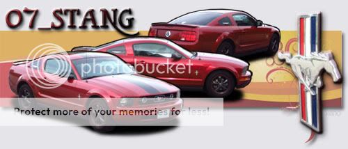
excellent idea! most of the stuff i learned was from looking at other designs, then adapting them to make them my own.
here are some of my fav sigs i've made (in no particular order):


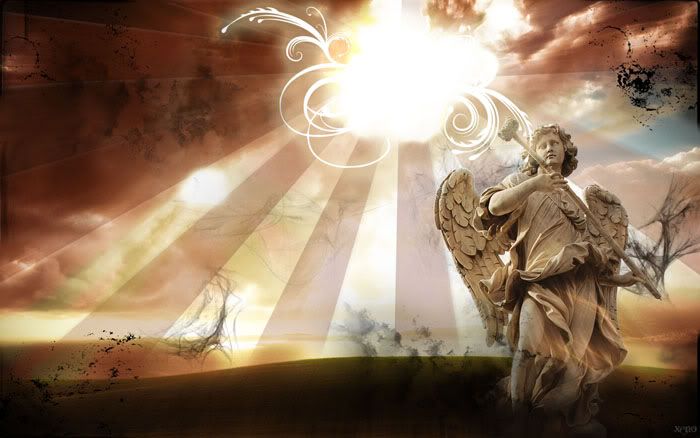
and here's my awesome wallpaper i made a few days ago (the only things that were not my 'doing' is the angel and the original background; all the effects, layout, etc are my doing... the angel and background did get altered, though, in the process):
if anyone wants to know anything 'technical' about them, just ask
here are some of my fav sigs i've made (in no particular order):
and here's my awesome wallpaper i made a few days ago (the only things that were not my 'doing' is the angel and the original background; all the effects, layout, etc are my doing... the angel and background did get altered, though, in the process):
if anyone wants to know anything 'technical' about them, just ask
Last edited by Xeno; 04-08-2010 at 10:17 AM.


 04-08-2010, 09:58 PM
#7
4th Gear Member
Join Date: Sep 2009
Location: Michigan
Posts: 1,830
04-09-2010, 02:50 PM
#9
4th Gear Member
Join Date: Sep 2009
Location: Michigan
Posts: 1,830
damn ls1mp. thats harsh! i could see u saying u dont like it!!!
plus their temporary until car gets repainted after body parts are chosen and ready. They look good some days to me and iffy others. But it's unique and I like them enough to keep them on.
plus their temporary until car gets repainted after body parts are chosen and ready. They look good some days to me and iffy others. But it's unique and I like them enough to keep them on.
04-09-2010, 05:13 PM
#10
HRnB's Minion
Join Date: Mar 2008
Location: 33.031780, -80.176679
Posts: 299
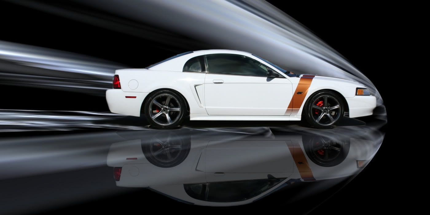
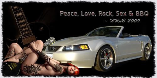
i don't like the color, like i said, they look like tear stains on a dog. that pic is one of the easiest yet still best looking i've done. i just took the whole screen, doubled it and flipped it, making the flipped copy at like 30% opacity to look like the reflection. looking back i could have done motion on the wheels to make it look like it was moving, but oh well.. and the one you kept as your sig was even easier than that and looks awesome as well. you're just easy to please 
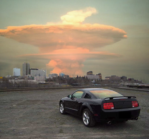
stangant: idk what all you ps'd in that top pic, but that pic look awesome
stangant: idk what all you ps'd in that top pic, but that pic look awesome
Last edited by ImpOnFire; 04-09-2010 at 05:15 PM.