business card
 12-24-2010, 05:37 PM
#11
2nd Gear Member
Thread Starter
Join Date: Nov 2003
Location: Connecticut
Posts: 283
I'm diggin that font a lot more than the last one...not exactly what I pictured but it works really well. I like the colored first letters and black on the rest, that works well with that font. As far as "MC Designs" I would still want the car, but with this font it wouldn't look right with the colored first letter thing. So if you come across a font similar to the mustang week one maybe try it with both Callahan and MC, if not, I do like this one, but maybe tuck the letters into the body of the car a bit more rather than them being under it as long as it doesn't get too screwy with the horizontal line that's right above the letters now. I can't tell you how much I appreciate this! I owe you a drink if you're ever in CT!
 12-29-2010, 08:42 AM
#13
2nd Gear Member
Thread Starter
Join Date: Nov 2003
Location: Connecticut
Posts: 283
Made one out of the 2nd one you did, I think it looks pretty good and I may run with it, just curious if you ended up with anything else? No big deal if not. I want to work on my sig next, it's gonna be geared more toward my '71. I just need to come up with some pics for you though, which should be interesting cuz the cars not even close to being put together right now, gotta see what I come up with.
Thanks again!!!
Thanks again!!!

 12-30-2010, 11:29 PM
#18
2nd Gear Member
Thread Starter
Join Date: Nov 2003
Location: Connecticut
Posts: 283
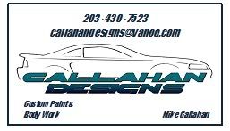
Agreed. Not to mention mcdesigns was already taken when I tried to create a yahoo email address, but callahandesigns was availible. It looks a lot better printed out then it does in this small pic...simple, but effective.
Thanks again Xeno!
Thanks again Xeno!
 09-08-2011, 11:32 PM
#20
2nd Gear Member
Thread Starter
Join Date: Nov 2003
Location: Connecticut
Posts: 283
Xeno...any chance you can convert the logo you made me a while back into a .OFM file??? I was trying to get it embroidered on some hats and the company I had doing it said they couldn't do it because of the outline around the letters and certain lines being less than 2pt. I know nothing about photoshop, but if there is a way to convert the file to this format I'd REALLY appreciate it!!! I'm fine if the letters have to be solid instead of gradient fill...just use the darker blue at the bottom to fill the whole letter and take the outline off the letters if need be.
Thanks!
Thanks!